Creating an ‘Etched Watermark’
This is a real easy tut that creates a watermark for using on stats tags or scrap kits.
I have been asked many times how I make my Incredimail footers so thought I would share with you.
Any similarities to any other tut are pure coincidence.
Supplies Needed
Font of choice, a script font is always pretty, I am using UpDock
A ding font OR pre-set shape
OR optional simple tubes don’t use one with too much detail as it becomes muddy and you loose the effect.
I am using a pre-set shape of a butterfly.
Ok ready lets get started 8-).
1/ Open a blank canvas size 500 x 500 (we will cut the waste later)
2/ Using font of choice type out your text don’t worry about colours as again we will lose this layer later, again font size doesn’t matter as we can resize once we have finished (better to be too big than too small though) for demonstration purposes I am using: Font size 72 anti-alias Sharp, stroke width 1, create as vector and my foreground box at null.
Using the nodes on your bounding box pull your text turn it rotate it etc until you are happy with how it looks, now go to Objects/align/centre in canvas, layers convert to raster layer name this layer text.
3/ Add 2 new layers to your layer pallet name the first one Cut-out and the second one Drop shadow4/ Make sure that your text layer is highlighted and go to selections/select all/ selections float/ selections de-float this will bring marching ants around your text, you can now delete your text layer
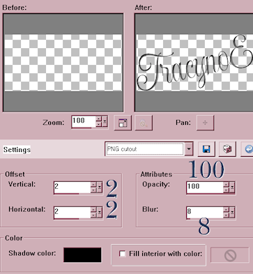
5/ Highlight the cutout layer and apply a cutout with these settings
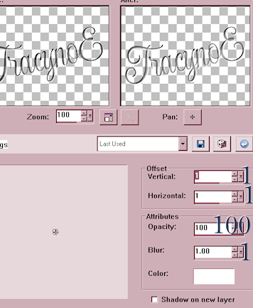
6/ Highlight the drop shadow layer and apply a drop shadow with these settings
OPTIONAL step
If you feel that it’s looking a little too dark repeat step 6
7/ Layers merge down.
8/ Select either a preset shape, tube or ding font I am using a pre-set shape (if using a tube add a layer), pull out your shape or ding until you are happy with it, don’t make this too large the main focus should be your text, layers convert to raster
9/ Add 2 new layers to your layer pallet name the first one cutout and the second one drop shadow
10/ Make sure that your vector (or tube) layer is highlighted and go to selections/select all/ selections float/ selections de-float this will bring marching ants around your shape ding or ding font, you can now delete this layer
11/ Highlight the cutout layer and apply a cutout with the same settings
12/ Highlight the drop shadow layer and apply a drop shadow with the same settings
13/ Layers merge down
14/ Move this layer down underneath your text layer move them both into position, it looks better if part of the text is partially on your shape, once you are happy with the positioning of your text and shape layers merge visible
15/ Using your crop tool go to your top tool bar and select the ‘Merged Opaque’ icon
this will bring your bounding box in tight to your new watermark double click in the centre and all waste canvas will be cut away.
It should now look something like this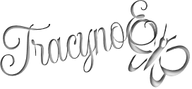
OPTIONAL steps
BEFORE cutting away your empty canvas
You could drag out a ‘box’ around your shape and text or even add another preset shape, then repeat you’re cutout and drop shadows the same as we did previously
Ending up with something like this, notice that I have changed the colour of my cutout shadow to a pale blue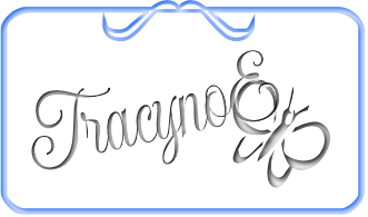
Adding the frame or a simple square around the ‘watermark’ makes a great stat footer or a logo for a scrap kit.
16/ you can now save your new watermark as a tube so that you have it ready for use, also save it as a PNG file to use for your scrap kit logo or Incredimail stat footers.
When using as a watermark tube it will be too large so don’t forget to change your ‘scale’ you can also change the layer opacity so that it will blend down better with your images, there are endless possibilities with this tut every time it is unique depending on fonts shapes etc
Here is another one that I made with a tube and different font (Velvet Script)
Before I merged all my layers I also lowered the opacity to 50 I left the tube on this one but lowered the opacity right down to 20
Had I have removed the tube completely well this is what we would of seen
Umm looks like my name over a splash lol not so pretty.
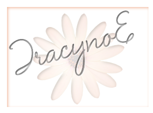
Here is the same ‘watermark’ but with a simple square around it this time I changed my cutout shadow to a pale orange that the original tube flower was
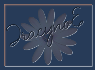
Here is the exact same image on a dark background
Saving as a PNG file to use on your stats and scraps means that you never have to worry about it as it will look good on 99% of your creations, on rare occasions you do loose some of the detailing yet another one will work out well I don’t know why this is lol
Well that’s the end of my tut I hope you have enjoyed creating a new ‘etched’ watermark logo or footer.




No comments:
Post a Comment